Popups
What are popups?
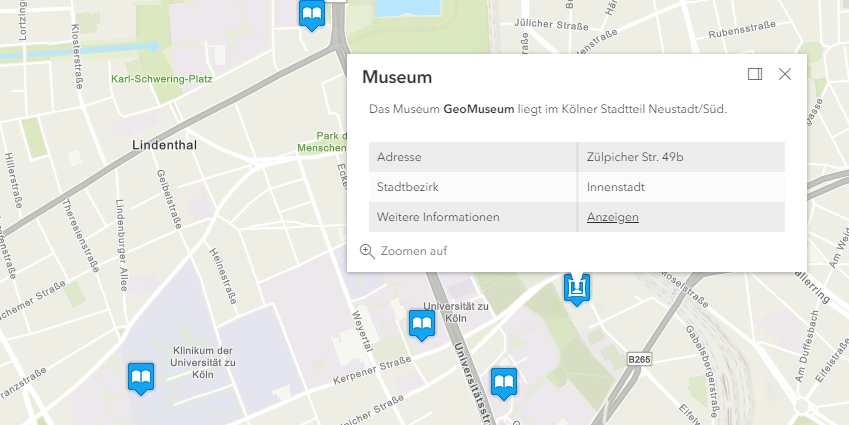
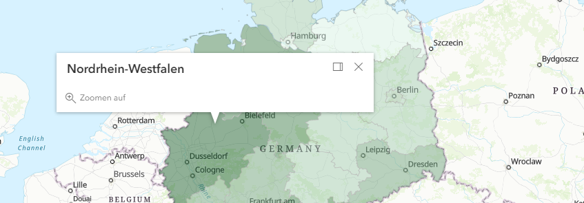
Popups are used to retrieve information about map objects (point, line, polygon) and make it available to the user. Depending on the map content, a click in the map opens a popup and displays information about one or more objects. If a click hits several objects the user can scroll through the objects or select a specific object from a list.
Popups can also be displayed for search results. Details are described on the page search.

Default popups
Required Bundle: popups-default
Activate default popups
A default popup can be used to view information about individual map objects with little configuration effort.
Add the popups-default bundle to an app to make the default popup available.
When clicking on an object of an ArcGIS map service (MapServer) or feature layer (FeatureServer) the user is shown a popup.
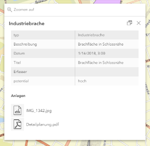
The dialog box displays a table containing all attributes, hiding system fields that are often irrelevant to the user.
Any file attachments are displayed underneath the table.

Do not open default popup for certain layers
As described in the preceding section, a default popup is displayed for all ArcGIS map services (MapServer) or feature layers (FeatureServer) visible on the map. To avoid displaying a popup for certain layers, use the following configuration:
{
    "layers": [
        {
            "id": "bevoelkerung",
            "url": "https://services2.arcgis.com/jUpNdisbWqRpMo35/arcgis/rest/services/Bev%C3%B6lkerung_nach_Alter/FeatureServer/0",
            "type": "AGS_FEATURE",
            "visible": true,
            "popupEnabled": false
        },
        {
            "id": "grenzen",
            "url": "https://services.conterra.de/arcgis/rest/services/common/grenzen/MapServer",
            "type": "AGS_DYNAMIC",
            "sublayers": [
                {
                    "id": 0,
                    "popupEnabled": false
                },
                {
                    "id": 1
                }
            ]
        }
    ]
}
In the preceding code sample, only popups for layer 1 of the "grenzen" service are displayed.
To display a custom popup instead of the default popup for specific layers, see the Individual popups section.
Configuration
The following parameters are available for configuration:
| Name | Description |
|---|---|
|
List of attributes that are not displayed in the table of the default popup. Default value: |
|
Specifies whether attachments are displayed in the default popup. Default value: |
|
Specifies if attachments are shown as a list or as preview images (if available). Default value: |
|
Defines how many decimal places of a floating point number are to be displayed. Default value: |
|
Specifies whether to display a thousand separator for numerical values. Default value: |
|
Format of date fields. Allowed values can be retrieved from this list of date formats . Default value: |
The configuration affects all default popups in the app. To customize individual layers, see the bundle documentation and the following section.
{
    "popups-default": {
        "Config": {
            "excludedFields": [
                "objectid",
                "objectid_0",
                "objectid_1",
                "shape",
                "st_area(shape)",
                "st_length(shape)",
                "st_area",
                "st_length"
            ],
            "enableAttachments": true,
            "attachmentsDisplayType": "list",
            "places": 2,
            "digitSeparator": true,
            "dateFormat": "short-date-short-time-24"
        }
    }
}| For more information about configuration, see the bundle documentation . |
Individual popups
Required Bundles: map-init
An individual popup can be configured for each map layer within the configuration in the bundle map-init.
Activate popups
To open a popup when clicking on a geo object, a so-called popupTemplate must be defined for the respective map layer.
Add the following configuration to a layer definition to configure a popup:
Note the differences for Feature Layer and MapServer sublayer configurations.
For MapServer services, the popupTemplate must be configured on the respective sublayer.
|
{
    "map-init": {
        "Config": {
            "map": {
                "basemap": "topo-vector",
                "layers": [
                    {
                        "id": "bevoelkerung",
                        "url": "https://services2.arcgis.com/jUpNdisbWqRpMo35/arcgis/rest/services/Bev%C3%B6lkerung_nach_Alter/FeatureServer/0",
                        "type": "AGS_FEATURE",
                        "visible": true,
                        "popupTemplate": {
                            "title": "{Name}",
                            "content": []
                        }
                    },
                    {
                        "id": "grenzen",
                        "url": "https://services.conterra.de/arcgis/rest/services/common/grenzen/MapServer",
                        "type": "AGS_DYNAMIC",
                        "sublayers": [
                            {
                                "id": 0,
                                "popupTemplate": {
                                    "title": "{g_name}",
                                    "content": []
                                }
                            }
                        ]
                    }
                ]
            }
        }
    }
}
In the sample, the title of a popup window is first assigned the Name attribute.

Design popup content
In the section content the contents of the popup can be defined.
Four different types are available for this purpose:
| Type | Description |
|---|---|
Text |
Free definable text.
It might contain field names enclosed in {}, for example |
Table |
The fields of an object can be displayed as a table.
The field The |
Diagrams or photos |
With this type diagrams and photos can be displayed in popups. If several contents of this type are configured, arrows to switch between the contents are added. The following diagram types are available:
A complete list of the details of this configuration can be found at the MediaContent API documentation . Diagram
Use the type Photo
|
File attachments |
If a layer has file attachments, use this configuration to show them to users. |
The different elements can be used several times and in a freely definable order in a popup.
{
"map-init": {
"Config": {
"map": {
"basemap": "topo-vector",
"layers": [
{
"id": "brachen",
"url": "https://services.conterra.de/arcgis/rest/services/mapapps/brachen/FeatureServer/0",
"type": "AGS_FEATURE",
"visible": false,
"outFields": [
"*"
],
"popupTemplate": {
"title": "{beschreibung}",
"content": [
{
"type": "attachments"
}
]
}
},
{
"id": "bevoelkerung",
"url": "https://services2.arcgis.com/jUpNdisbWqRpMo35/arcgis/rest/services/Bev%C3%B6lkerung_nach_Alter/FeatureServer/0",
"type": "AGS_FEATURE",
"visible": true,
"outFields": [
"*"
],
"opacity": 0.5,
"popupTemplate": {
"title": "{Name}",
"content": [
{
    "type": "text",
    "text": "Das Land {Name} hat {EWZ} Einwohner."
},
{
"type": "fields",
"fieldInfos": [
{
"fieldName": "Gesamt_Weiblich",
"label": "Weibliche Einwohner",
"format": {
"places": 0,
"digitSeparator": true
}
},
{
"fieldName": "Gesamt_Maennlich",
"label": "Männliche Einwohner",
"format": {
"places": 0,
"digitSeparator": true
}
}
]
},
{
"type": "media",
"mediaInfos": [
{
"title": "Altersstruktur weiblicher Einwohner",
"type": "bar-chart",
"value": {
"theme": "WatersEdge",
"fields": [
"W_Unter_3",
"W_3_bis_5",
"W_6_bis_14",
"W_15_bis_17",
"W_18_bis_24",
"W_25_bis_29",
"W_30_bis_39",
"W_40_bis_49",
"W_50_bis_64",
"W_65_bis_74",
"W_75_und_aelter"
],
"normalizeField": null
}
},
{
"title": "<b>Fotos aus {Name}</b>",
"type": "image",
"value": {
"sourceURL": "https://picsum.photos/300/200"
}
}
]
}
]
}
}
]
}
}
}
}|
A detailed sample configuration of the preceding options can be found in the blog article Neue Möglichkeiten für Popups in map.apps Linie 4 . Further information about the configuration can be found in the documentation of the ArcGIS API for JavaScript . |
|
To avoid having to make the same configurations more than once, the following options are available:
|
Extent popups programmatically
Required Bundles: popups, <custom-popup-bundle>
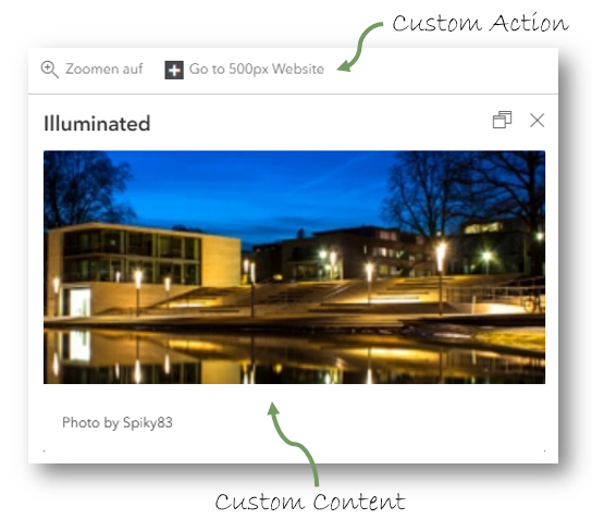
With the help of prepared interfaces and patterns, popups can be extended programmatically to cover requirements for the display of content that go beyond the capabilities of the popups described preceding. The contents of the popup can be changed and actions can be added to the popup. These actions can be displayed depending on the content of the selected object. Your own code is provided as a bundle and can be reused in any number of apps for any number of layers.
Details are described in the bundle documentation .

Popup behavior options
Required Bundles: popups
The following options are available in the popups bundle to control the behavior of popups:
| Name | Description | Default Value |
|---|---|---|
|
Specifies whether the object belonging to the popup is highlighted in color on the map. This option is available for all 3D objects. For 2D objects it can only be used if WebGL rendering is used. |
|
|
Determines whether the popup is closed when the view is changed (for example when zooming or moving the map). |
|
|
Determines whether the popup is collapsed when the title is clicked. |
|
|
Determines whether all popups are opened docked. |
|
|
Determines whether docking is disabled for all popups. |
|
|
Specifies whether docking is active by default. |
|
|
Defines whether the docking behavior is forced when a certain viewport size is exceeded. Use the following configuration to set break points: |
|
|
Determines whether the button for docking and undocking is displayed. |
|
|
Determines the position at which a docked popup is displayed.
Allowed values are: |
|
{
    "popups": {
        "Config": {
            "highlightEnabled": true,
            "autoCloseEnabled": false,
            "collapseEnabled": false,
            "dockingForced": false,
            "dockingDisabled": false,
            "dockEnabled": false,
            "dockPosition": "auto",
            "dockButtonEnabled": true,
            "dockBreakpoint": true
        }
    }
}- Open popups docked by default
-
To open popups docked at the edge by default, the following configuration can be set:
{
    "popups": {
        "Config": {
            "dockEnabled": true,
            "dockBreakpoint": false
        }
    }
}
| For more information about configuration, see the bundle documentation . |