Map Control
Map Content Control (TOC)
Required Bundle: toc
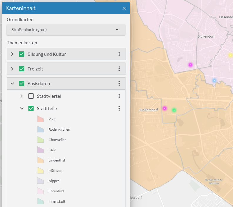
Map content control is used to activate or deactivate map content. This can be used, for example, to activate individual services or their layers, to control the transparency of a service and to display a legend for each layer and its description. The map content control can also be used to select the displayed base map.

Operational maps
The map content control displays all operational maps according to their configuration. The behavior can be customized with the following options:
actions-
This parameter determines which actions are offered for individual entries in the map content control.
The default value lists all available actions. Alternatively, only certain actions can be allowed.
Allowed Values:
zoom-to-extentPerforms a zoom to the full extent of the service or layer.
activate-childrenActivates all child contents of the entry.
deactivate‑childrenDeactivates all child contents of the entry.
change-opacityChanges the opacity of the map.
show-descriptionShows the description of the service or layer. This is retrieved from the respective service or layer. Alternatively it can be configured in the app.
show-copyrightShows the copyright information of the service or layer.
This is retrieved by the respective service or layer. Alternatively, it can be configured in the app.
Default:
["*"] maxBasemapsThreshold-
Maximal amount of basemaps to show as flat list.
If the amount of basemaps is greater as the given number a drop-down is rendered.
maxVisibleTitleLines-
Number of text-lines that are displayed for layer and service titles.
If titles are longer than this value, texts are truncated.
showBasemaps-
Enables modification of basemaps using the map content control.
See basemaps.
showLayerLegend-
Enables a legend for each layer.
The legend is hidden when the corresponding layer is not visible.
{
    "toc": {
        "Config": {
            "actions": [
                "show-description",
                "zoom-to-extent",
                "activate-children",
                "deactivate-children",
                "change-opacity",
                "show-copyright"
            ],
            "showBasemaps" : false,
            "showLayerLegend": false,
            "maxVisibleTitleLines": 3,
            "maxBasemapsThreshold" : 3
        }
    }
}
Show element expanded at startup
To initially expand an element in the map control, set the following configuration on the corresponding service or layer:
{
    "id": "grenzen",
    "type": "AGS_DYNAMIC",
    "url": "https://services.conterra.de/arcgis/rest/services/common/grenzen/MapServer",
    "initiallyExpandedInToc": true
}
Hide specific services or layers
To hide certain services or layers in the map control, add the property "listMode": "hide" to the respective service or layer.
In the following code sample, only the layer Gemeinden is displayed in map control.
The layer "Kreise" is always displayed in the map and the visibility cannot be changed by the user.
{
    "id": "grenzen",
    "type": "AGS_DYNAMIC",
    "url": "https://services.conterra.de/arcgis/rest/services/common/grenzen/MapServer",
    "sublayers": [
        {
            "id": 0,
            "title": "Gemeinden"
        },
        {
            "id": 1,
            "title": "Kreise",
            "listMode": "hide"
        }
    ]
}
To exclude certain layers not only from the map control but completely from the map, see the example for ArcGIS Dynamic Map Service.
Basemaps
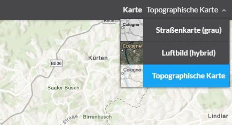
To allow the user to select base maps via the map content control, activate the showBasemaps setting by the following configuration:
{
    "toc": {
        "Config": {
            "showBasemaps" : true
        }
    }
}
By default, the base maps available for selection are displayed as a list if there are no more than three maps. If more than three maps are available, a drop-down button is displayed instead.
To change the limit from which this change of interface occurs, use the following configuration:
{
    "toc": {
        "Config": {
            "showBasemaps" : true,
            "maxBasemapsThreshold" : 3
        }
    }
}| For more information about configuration, see the bundle documentation . |
Customize the layout of the widget
To customize the layout of the widget in the desktop layout, adjust the following configuration:
{
    "templates": {
        "TemplateModel": {
            "widgets": [
                {
                    "widgetRole": "tocWidget",
                    "window": {
                        "marginBox": {
                            "l": 20,
                            "t": 125,
                            "h": 450,
                            "w": 435
                        }
                    }
                }
            ]
        }
    }
}
For details about customizing widgets, see layout.
Alternative possibilities to control basemaps
Basemap Toggler
Required Bundle: basemaptoggler
This bundle allows switching multiple basemaps in a drop-down menu. Furthermore own styles/icons can be applied for each entry in the drop-down menu.

buttonStyles-
Adding of custom style- and icon-classes for the corresponding drop-down menu entry. The style is connected to the corresponding basemap by its ID.
showLabel-
Show title of the basemap
{
    "basemaptoggler": {
        "Config": {
            "itemStyles": {
                "esri_street": {
                    "iconClass": "icon-street"
                },
                "esri_topo": {
                    "iconClass": "icon-map-paper"
                },
                "esri_hybrid": {
                    "iconClass": "icon-satellite"
                }
            },
            "showLabel": true
        }
    }
}| For more information about configuration, see the bundle documentation . |
Basemap Switcher
Required Bundle: basemapswitcher
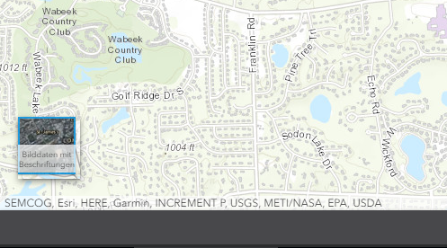
This bundle allows to switch between two basemaps: One is the current visible basemap, the other one is configured within the bundle. Upon click these two basemaps are exchanged.

{
    "basemapswitcher": {
        "Config": {
            "nextBasemap": "hybrid",
            "titleVisible": true
        }
    }
}| This bundle cannot be used in an app together with the other bundles mentioned before. |
| For more information about configuration, see the bundle documentation . |